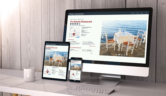
If you want your site to succeed, you need to make it mobile-friendly. Here are a few great plugins to help you do just that.
By AJ Morris
Mobility is the future. With smartphones and tablets fast eclipsing desktop devices for browsing the web, mobile-friendliness is one of the core elements to online success (and a core ranking factor in Google Search). It’s no longer a question of if you should support mobile devices – it’s a question of how you’re going to do so.
The great thing about using WordPress to design your site is that you don’t need to be an HTML, CSS, or development wizard to get your site ready for mobile devices. You just need a bit of knowhow. I can help with that.
Choose A Responsive Theme
The first, most important step is to ensure your current WordPress theme is designed to be easily viewable on mobile. This is actually an easy thing to test – just download the Theme Check plugin, and you can determine right from your dashboard if your theme makes the cut (as well as whether or not it meets WordPress’s other theme review standards). If it turns out your site isn’t mobile-friendly, you are going to have to do a bit of re-designing.
You have three options here.
The first is to check existing repositories to see if you can find a responsive theme that fits your site. The second is to design and code a responsive theme on your own. This article by Smashing Magazine, though a bit dated walks you through the process of doing so.
Last but not least, you could also look into using a plugin such as Jetpack or WP Mobile Detector to do the job.
Here are a few of the theme libraries I would personally recommend if you decide on option one:
- Color Lib
- Code In WP
- Themeforest
- WordPress.org
Tailor Your Content For Mobile Devices
Getting your theme right is only the first step. I would also advise tailoring your content so that it can be read comfortably on mobile devices as well as desktop computers. Contrary to popular belief, this does not mean shortening your blog posts – long-form content actually does better on mobile devices than short-form.
What it does involve is the following steps:
- Reduce the number of images on your site.
- Reduce the resolution of the images on your site.
- Remove Flash content from your site, and replace it with HTML5 where possible.
- Avoid using pop-ups anywhere on your site.
- Break up your content into smaller, easily-digestible paragraphs, two to four sentences at most.
- Remove elements such as sidebars – they are often functionally useless on mobile devices, anyway.
- Optionally, you can also consider looking into Google’s Accelerated Mobile Pages Project.
Tweak for Speed
Last but certainly not least, you need to keep in mind that although mobile devices are more powerful than they used to be, they are still a far cry from desktops. They do not have the processing power of a full computer, nor do they have the bandwidth of one. This means that you need to do everything you can to cut down trim the fat on your site for mobile users.
This includes, but is not limited to:
- Only importing libraries that are absolutely essential for a page’s functionality.
- Loading CSS files and JavaScript for each page individually.
- Always load JavaScript files after HTML.
- Do not use too many dynamic components.
- Use a tool such as Google’s PageSpeed Insights to determine your site’s performance and see tips on how to improve it.
AJ Morris is the product manager at LiquidWeb. Follow him at @ajmorris.


